
This group of assets include an infographic, interactive keynote and video walkthrough of the keynote.
I chose original icons and colors to stand out to make the poster more unique and used san serif fonts that are easier to read. I sampled and used the colors from the original KinetECO logo for the background teal and the green boxes. I used Adobe Kuler to find 5 colors that compliment each other for the different options. I believe these choices are clean and stand out more to a younger crowd.
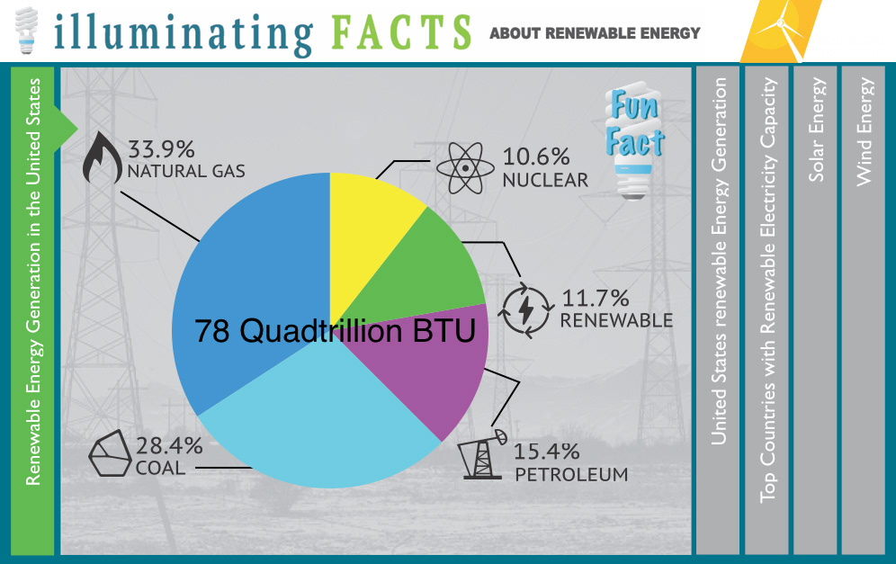
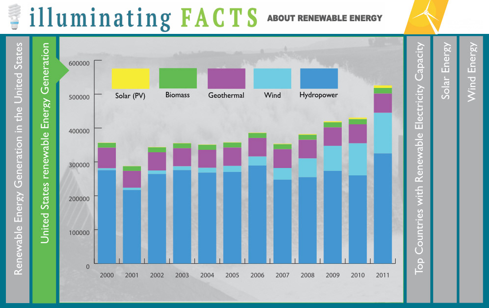
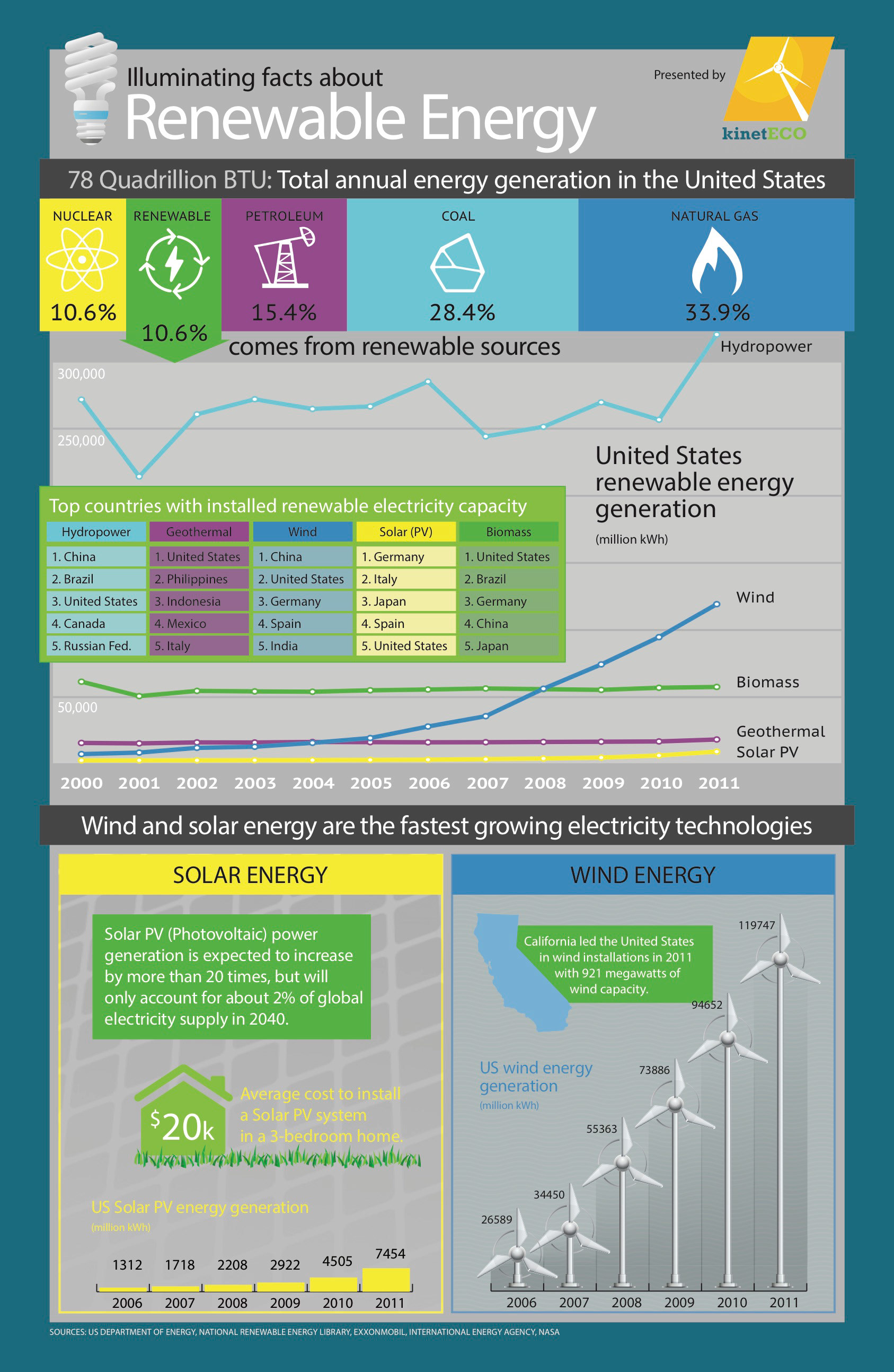
The next step was creating the keynote visuals. The first graph I chose to focus on was the Renewable Energy Generation in the United States graph. I envisioned the information displayed as a pie graph so the audience could compare the information as a whole. I chose a bar graph for the the United States renewable Energy Generation graph so you can compare each of the different types of energy percentage as well as their growth. Explaining the information the way I have will give the audience a greater understanding of the big picture.
Then I created a video to add audio to the presentation. One thing that I wanted to add to the slides were more interesting facts. I researched more information and added it the content that was already in the infographic. I called these my “Fun Facts”. Once the graphs were changed I found great images to support the content including using the lightbulb stock image that was given in week one. Along with the audio, transitions had to be created to match the rollout of the words. My favorite choice was including the bouncing light bulb when I say “fun fact”. I also added a music track to engage the audience more. I used a blue snowball mic with a frequency response of 40Hz to 18kHz with a pop filter and bluetooth Pioneer over the ear headset with frequency response 9 Hz ~ 22 000 Hz.