
I created travel posters that used the fundamentals of working with typography in creating effective visual presentations. I used Photoshop to create all three images.
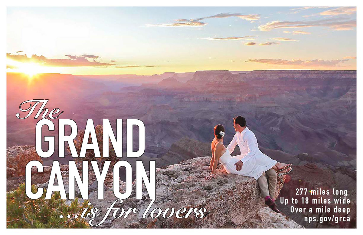
This is the first poster is beautiful and shows the idea of love that I was looking for. I wanted to showcase the amazing image and not overpower it with text. I started with a white border and used white text to pair it with the white colors on the couples clothes. I believe it balanced out the lower half with the use of white on both sides of the bottom of the poster. The “Grand Canyon” text I choose is big and bold drawing your eye to the most important thing. I also used a script font for “the” and “…is for lovers” to give the audience the idea of happiness and love. The additional information was placed in the bottom right corner utilizing the angles of the rock to frame it. I think this photo, font color and type chosen give the audience the feeling I was intending for them; Love.
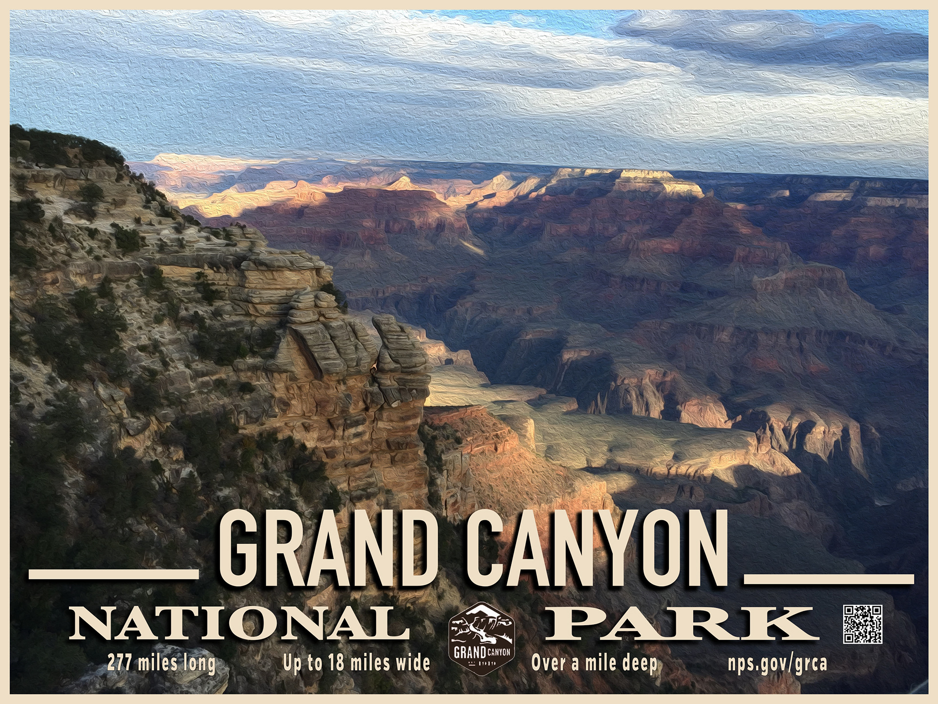
Researching more traditional Grand Canyon posters, I found simple images with bold text on the lower half. I decided to utilize these ideas in my second poster. This time I chose a photo that my brother took while at the location. I used Photoshop to change the image slightly to look more like a painting. The color of the border and text was sampled from the mountains at the top of the photo. Again, I chose a large san serif font for the “Grand Canyon”. I added lines on either side in order to create a banner like quality at the bottom of the image. The font for “National Park” took me a while to get it right. Balancing the font sizes and space between the two words was difficult. National has eight letters and Park has only four. I had to play with the height and width of them to find something balanced and pleasing to look at. Park ended up being too wide and have too much leading, so I balanced the space with a QR Code I created that went to the ups.gov/grca website listed below it. I also found a great Grand Canyon badge to place in-between them. Lastly, I added the additional facts on the bottom equally spaced. I utilized the san serif font from the “Grand Canyon” so they would easier to read in a smaller size.
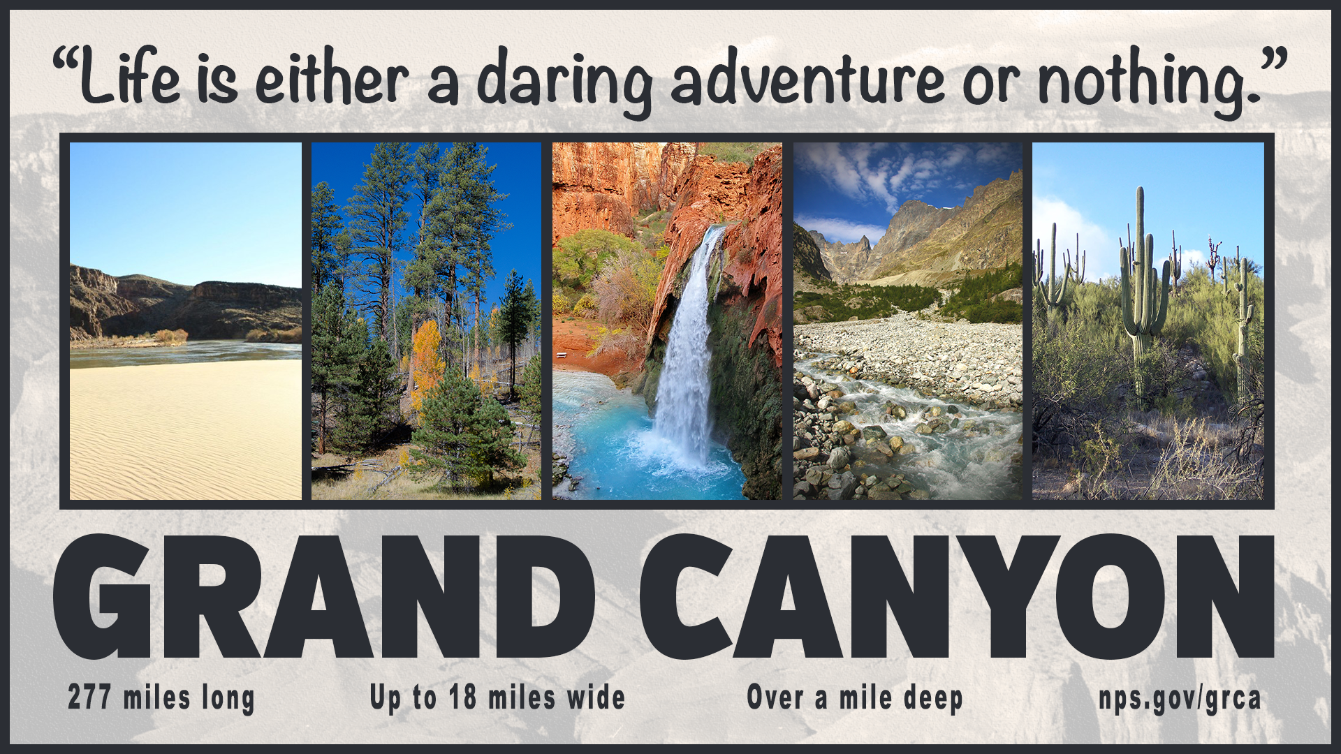
The last poster I created I wanted to showcase more facts about the Grand Canyon and try to put more text like the ones Ina Saltz did in her videos. However the more text I placed on an image the busier it got. Instead I chose to use images to showcase the facts instead of the text. One fact that was very interesting to me was that there were lots of different ecosystems with the canyon itself. I found Creative Commons images from flikr to showcase them. I found images for the desert, forest, beach, rocky areas and waterfall areas. These were so amazing that I wanted to put them all on one poster. I started with a background photo that was within the downloaded photos on the LMS. I made it black and white then tinted it sepia with Photoshop. I also made it more opaque as well to allow the photos on top to pop. I balanced all 5 photos using the same frame size and border. The color of the font and borders was sampled from the mountains in the middle picture. This gray/brown worked very well on top of the opaque background. Also utilized the font “VerbExCondUltra” that was given to us to use for the “Grand Canyon”. Lastly, I balanced the bottom with the additional facts spaced out equally again.